Molecules
Account Dropdown
The Account Dropdown component will show a list of other accounts to switch to when triggered
with a click or tap. The dropdown list defaults to be left aligned with the trigger text,
but it can be right aligned by adding the account-dropdown--right class.
List Title
<div class="account-dropdown js-account-dropdown">
	<span class="account-dropdown__toggle js-account-dropdown__toggle">List Title</span>
	<ul class="account-dropdown__list">
	</ul>
</div>
Account Table
Tabular data table styles. On small screens the columns will go away and therefore
the column headings. You can prefix data on small screens by adding a <td class="account-table__date" data-label="Amount Due">
attribute with the label value to the <td> element for any data row.
| Account Number | Address | Past Due After | Amount Due | |
|---|---|---|---|---|
| 0312994059 | 115 Moss Grove Blvd | 10/9/2015 | $1,493.12 | Payment Options |
| 1973340006 | 2021 Cumberland Ave Store #10173 | 10/5/2015 | $2,283.64 | Payment Options |
<table class="account-table">
	<thead>
		<tr>
			<th class="account-table__number">Account Number</th>
			<th>Address</th>
			<th class="account-table__date">Past Due After</th>
			<th class="account-table__amount">Amount Due</th>
			<th class="account-table__action"></th>
		</tr>
	</thead>
	<tbody>
		<tr>
			<td class="account-table__number" data-label="Account Number">
				<a href="/customer/accounts/0312994059">0312994059</a>
			</td>
			<td data-label="Service Address">
				115 Moss Grove Blvd
			</td>
			<td class="account-table__date" data-label="Past Due After">
				10/9/2015
			</td>
			<td data-label="Amount Due">
				$1,493.12
			</td>
			<td class="account-table__action">
				<a href="/customer/accounts/account/payments">Payment Options</a>
			</td>
		</tr>
		<tr>
			<td class="account-table__number" data-label="Account Number">
				<a href="/customer/accounts/1973340006">1973340006</a>
			</td>
			<td data-label="Service Address">
				2021 Cumberland Ave Store #10173
			</td>
			<td class="account-table__date" data-label="Past Due After">
				10/5/2015
			</td>
			<td data-label="Amount Due">
				$2,283.64
			</td>
			<td class="account-table__action">
				<a href="/customer/accounts/account/payments">Payment Options</a>
			</td>
		</tr>
	</tbody>
</table>
Activity Table
Tabular data table styles. On small screens the columns will go away and therefore
the column headings. You can prefix data on small screens by adding a data-label
attribute with the label value to the <td> element for any data row.
| Date | Activity | Amount | |
|---|---|---|---|
| Scheduled for 07/1/15 | * Pending Payments * Bank Draft Payment Number: PE‑86901043456 | $77.89 | Cancel |
| 07/1/15 | Current Bill Due 07/15/15 | $9999.99 | Pay Now |
| 07/1/15 | Complete Payment: Bank Draft Payment Number: PE‑86901043456 | $64.34 | |
| 07/1/15 | Bill Due 07/15/15 | $27.33 |
<table class="activity-table">
<thead>
<tr>
<th class="activity-table__date">Date</th>
<th class="activity-table__activity">Activity</th>
<th class="activity-table__amount">Amount</th>
<th class="activity-table__action"></th>
</tr>
</thead>
<tbody>
<tr class="activity activity--pending">
<td>
<span class="activity__date">Scheduled for 07/1/15</span>
</td>
<td>
<span class="activity__title">* Pending Payments * Bank Draft</span>
<span class="activity__memo">Payment Number: PE‑86901043456</span>
</td>
<td data-label="Amount: ">
<span class="activity__amount">$77.89</span></td>
<td class="activity-table__action">
<a href="#">Cancel</a>
</td>
</tr>
<tr class="activity activity--due">
<td>
<span class="activity__date">07/1/15</span>
</td>
<td>
<span class="activity__title"><a href="#">Current Bill Due 07/15/15</a>
</span>
<span class="activity__memo"></span>
</td>
<td data-label="Amount: ">
<span class="activity__amount">$9999.99</span></td>
<td class="activity-table__action">
<a href="#" class="button button--orange button--border">Pay Now</a>
</td>
</tr>
<tr class="activity">
<td>
<span class="activity__date">07/1/15</span>
</td>
<td>
<span class="activity__title">Complete Payment: Bank Draft</span>
<span class="activity__memo">Payment Number: PE‑86901043456</span>
</td>
<td data-label="Amount: ">
<span class="activity__amount">$64.34</span></td>
<td class="activity-table__action">
</td>
</tr>
<tr class="activity">
<td>
<span class="activity__date">07/1/15</span>
</td>
<td>
<span class="activity__title"><a href="#">Bill Due 07/15/15</a>
</span>
<span class="activity__memo"></span>
</td>
<td data-label="Amount: ">
<span class="activity__amount">$27.33</span></td>
<td class="activity-table__action">
</td>
</tr>
</tbody>
</table>Alerts
Default
Alerts are used to notify the user of the status of form actions or status related to their account. They should be placed above the form or content they are related to. The alert icon, title and close button are all optional.
Alert Title
The password you entered is invalid, please try again.<div class="alert js-alert js-alert--sticky" role="alert">
<h1 class="alert__title"><span data-grunticon-embed class="alert__icon icon-warning"></span> Alert Title</h1>
The password you entered is invalid, please try again.
</div>Warning
The password you entered is invalid, please try again.
<div class="alert alert--warning js-alert js-alert--sticky" role="alert">

	The password you entered is invalid, please try again.
</div>
Info
Alert Title
Some information that is not super important.<div class="alert alert--info js-alert js-alert--sticky" role="alert">
<h1 class="alert__title"><span data-grunticon-embed class="alert__icon icon-warning"></span> Alert Title</h1>
Some information that is not super important.
<button class="alert-close js-alert__close" aria-label="Close">
<svg x="0px" y="0px" width="16px" height="16px" viewBox="0 0 16 16">
<path class="i-close" fill="#FFFFFF" d="M16,2.9L13.1,0L8,5.1L2.9,0L0,2.9L5.1,8L0,13.1L2.9,16L8,10.9l5.1,5.1l2.9-2.9L10.9,8L16,2.9z" />
</svg>
</button>
</div>Success
Your changes were made successfully.
<div class="alert alert--success js-alert js-alert--sticky" role="alert">

	Your changes were made successfully.
	<button class="alert-close js-alert__close" aria-label="Close">
		<svg x="0px" y="0px" width="16px" height="16px" viewBox="0 0 16 16">
			<path class="i-close" fill="#FFFFFF" d="M16,2.9L13.1,0L8,5.1L2.9,0L0,2.9L5.1,8L0,13.1L2.9,16L8,10.9l5.1,5.1l2.9-2.9L10.9,8L16,2.9z" />
		</svg>
	</button>
</div>
Aside Messages
<aside class="aside-messages">
	<h1 class="aside-messages__heading">Account Messages</h1>

	<p class="aside-messages__message">Help your neighbors stay warm: Give to Project Help to provide emergency energy assistance to needy families. Give on your KUB bill (see back), at Food City and Home Federal Jan. 4-29, or at KUB payment kiosks. For more, see kub.org.</p>

	<p class="aside-messages__message">Holiday Help: Give KUB gift cards for hard-to-buy-for relatives or people on a tight budget. There’s no fee to purchase or use cards. See sub.org for more.</p>

	<p class="aside-messages__message">See your Jan. bill for your Round It Up contribution statement for tax purposes.</p>
</aside>
Bar Graph
Graph Title
| This Year |
|---|
| Last Year |
<h2 class="bar-graph__heading">Graph Title</h3>

	<table class="bar-graph">
		<caption class="bar-graph__caption">Table description goes here</caption>
		<tbody>
			<tr class="bar-graph__section">
				<th class="bar-graph__label">This Year</th>
			</tr>
			<tr class="bar-graph__section">

				<th class="bar-graph__label">Last Year</th>
			</tr>
		</tbody>
</table>Callout
The type and number of electrical permits you must purchase dpend on the type of home construction
Temporary permit - required if your address needs a temporary power supply during construction.
Rough-in permit - required if you are installing the wiring inside the home.
Rough-in (underground) permit - required if the home will be served by underground power lines.
HVAC permit - required if installation also includes the HVAC system.
Final permit - required to verify final inspection before service can begin.
<div class="aside-callout">
	<h1 class="aside-callout__heading">The type and number of electrical permits you must purchase dpend on the type of home construction</h1>

	<p>Temporary permit - required if your address needs a temporary power supply during construction.</p>
	<p>Rough-in permit - required if you are installing the wiring inside the home.</p>
	<p>Rough-in (underground) permit - required if the home will be served by underground power lines.</p>
	<p>HVAC permit - required if installation also includes the HVAC system.</p>
	<p>Final permit - required to verify final inspection before service can begin.</p>
</div>
Card
Card Heading
Nullam id dolor id nibh ultricies vehicula ut id elit. Cras justo odio, dapibus ac facilisis in, egestas eget quam. Sed posuere consectetur est at lobortis. Cum sociis natoque penatibus et magnis dis parturient montes, nascetur ridiculus mus. Integer posuere erat a ante venenatis dapibus posuere velit aliquet. Sed posuere consectetur est at lobortis.
<div class="card js-eq-heights__target">
	<h1 class="card__heading">Card Heading</h1>

	<p>Nullam id dolor id nibh ultricies vehicula ut id elit. Cras justo odio, dapibus ac facilisis in, egestas eget quam. Sed posuere consectetur est at lobortis. Cum sociis natoque penatibus et magnis dis parturient montes, nascetur ridiculus mus. Integer posuere erat a ante venenatis dapibus posuere velit aliquet. Sed posuere consectetur est at lobortis.</p>
</div>
Content Overview
The content overview is placed after the page heading and before the primary content to provide some kind of overview text related to the content, whether the content be text or a form.
Thank you for creating your website login. You now have greater options for managing your KUB services. What would you like to do next?
<div class="content-overview">
	<p>Thank you for creating your website login. You now have greater options for managing your KUB services. What would you like to do next?</p>
</div>
Dropdown
What Service do you need?
<div class="dropdown">
	<h2 class="dropdown__prompt">What Service do you need?</h2>

	<select class="dropdown__select">
	</select>
</div>
Global Alerts
Default
Global alerts are used for sitewide notifications that are placed below the account-header. There can be multiple global alerts on a single page.
The password you entered is invalid, please try again.
<div class="global-alert js-alert">
	<div class="l-max-width">
		<div class="global-alert__content">
			The password you entered is invalid, please try again.
			<span class="alert-close icon-close js-alert__close"></span>
		</div>
	</div>
</div>
Warning
The password you entered is invalid, please try again.
<div class="global-alert global-alert--warning js-alert">
	<div class="l-max-width">
		<div class="global-alert__content">
			The password you entered is invalid, please try again.
			<span class="alert-close icon-close js-alert__close"></span>
		</div>
	</div>
</div>
Info
Some information that is not super important.
<div class="global-alert global-alert--info js-alert">
	<div class="l-max-width">
		<div class="global-alert__content">
			Some information that is not super important.
			<span class="alert-close icon-close js-alert__close"></span>
		</div>
	</div>
</div>
Success
Your changes were made successfully.
<div class="global-alert global-alert--success js-alert">
	<div class="l-max-width">
		<div class="global-alert__content">
			Your changes were made successfully.
			<span class="alert-close icon-close js-alert__close"></span>
		</div>
	</div>
</div>
Hero Map
Outage Map
View Outages<div class="hero-map">
<img src="/images/outage-map.jpg" alt="Outage Map" class="hero-map__image" />
<div class="hero-map__content">
<h2 class="hero-map__title">Outage Map</h2>
<a href="" class="action-link icon-text-arrow-right ">
View Outages
</a>
</div>
</div>Hero Message
<div class="hero-message">
	<h1 class="hero-message__heading">
		<span class="hero-message__icon icon-lightning"></span>
		Storm Mode
	</h1>

	<div class="hero-message__content">
		<p>Severe Weather may enter our service area this evening. Correct contact info makes it easier to help you after a storm. Log into your account to update your contact information, and stay updated.</p>
	</div>

	<footer class="hero-message__footer">
		<button class="button button--blue">
			Report Outage
		</button> <button class="button button--orange">
			Check My Status
		</button> </footer>
</div>
Hint
A hint is a link that pops up a balloon with text on click. The click event toggles a
.is-active class to the root of the component.
Hint Trigger
What's This?
Duis mollis, est non commodo luctus, nisi erat porttitor ligula, eget lacinia odio sem nec elit.
<div class="hint">
<span class="hint__toggle">Hint Trigger</span>
<div class="hint__balloon" aria-hidden="false">
<h1 class="hint__title">What's This?</h1>
<p>Duis mollis, est non commodo luctus, nisi erat porttitor ligula, eget lacinia odio sem nec elit.</p>
</div>
</div>Modal
The modal dialog component is hidden until triggered by some kind of action. To reveal the modal Javascript must
simply change the .modal-wrapper element to display:block. The .modal__message element is optional.
Some Sample Modal Content
Shank corned beef prosciutto, shoulder meatball pastrami tenderloin landjaeger. Ground round prosciutto beef landjaeger, meatball meatloaf frankfurter jowl. Picanha landjaeger turducken sausage ball tip. Leberkas beef pig venison, salami jowl capicola turducken strip steak drumstick biltong short loin short ribs turkey pork belly. Pancetta frankfurter cow beef ribs pork loin. Beef pork loin ribeye pork hamburger, andouille capicola brisket bresaola prosciutto shank shoulder filet mignon. Pastrami ribeye bacon pork drumstick.
<button class="button js-modal-trigger">Trigger Modal</button>
<div class="modal-wrapper">
<div class="modal">
<button class="modal__close icon-close-icon">
<span class="is-visually-hidden">Close Modal</span>
</button>
<div class="modal__message">
<p>A sample message for this dialog.</p>
</div>
<div class="modal__content">
<h2>Some Sample Modal Content</h2>
<p>Shank corned beef prosciutto, shoulder meatball pastrami tenderloin landjaeger. Ground round prosciutto beef landjaeger, meatball meatloaf frankfurter jowl. Picanha landjaeger turducken sausage ball tip. Leberkas beef pig venison, salami jowl capicola turducken strip steak drumstick biltong short loin short ribs turkey pork belly. Pancetta frankfurter cow beef ribs pork loin. Beef pork loin ribeye pork hamburger, andouille capicola brisket bresaola prosciutto shank shoulder filet mignon. Pastrami ribeye bacon pork drumstick.</p>
</div>
</div>
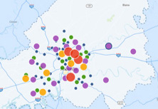
</div>Outage Preview
Pagination
<ul class="pagination">
	<li class="pagination__item pagination__item--prev"><a href="#" class="pagination__link  icon-text-arrow-left">Previous</a></li>
	<li class="pagination__item"><a href="#" class="pagination__link">2</a></li>
	<li class="pagination__item is-current">3</li>
	<li class="pagination__item"><a href="#" class="pagination__link">4</a></li>
	<li class="pagination__item"><a href="#" class="pagination__link">5</a></li>
	<li class="pagination__item pagination__item--next"><a href="#" class="pagination__link  icon-text-arrow-right">Next</a></li>
</ul>
Promo Panel
<div class="promo promo--callout">
	<img class="promo__image" src="" alt="">

	<div class="promo__content">
		<h3 class="promo__heading"></h3>
		<div class="promo__body">


		</div>

	</div>
</div>
Severance
The severance notice is intended to go at the top of pages as a high priority notification.
Warning — Your account is in default
<div class="severance">
<h1 class="severance__title">Warning — Your account is in default</h1>
<p class="severance__message">
Your power will be shut off soon if you do not pay your bill.
Please settle your outstanding balance now.
</p>
</div>Sidebar Articles
<article class="aside-article">
	<img class="aside-article__image" src="" />

	<div class="aside-article__content">
		<h1 class="aside-article__heading"></h1>
		<p class="aside-article__summary"></p>
		<a href="" class="action-link icon-text-arrow-right aside-article__link">
			Learn More
		</a>
	</div>
</article>
Start Stop
Start or Stop service easily and quickly.
We'll take you through the steps needed to start new service or stop service on your existing account.
<div class="start-stop">
	<div class="start-stop__cta">
		<button class="button button--bright-blue">Start/Stop Service</button>
	</div>

	<div class="start-stop__content">
		<h2 class="heading_e">Start or Stop service easily and quickly.</h2>

		<p>We'll take you through the steps needed to start new service or stop service
			on your existing account.</p>
	</div>
</div>